Research
)
By Darren Leader, Graphic Designer, Researcher and Educator
‘How are commercial trademarks connected with Medieval Norwich?’, this question was contemplated at a recent event at Dragon Hall, a venue in Norwich originally built in 1427 for the purpose of trade.
Modern-day brands create logos to symbolise aspirational products, services and values. Varied designs are intuitively deciphered and consumed, inspiring customer fascination and loyalty. But our ability to decode signs and symbols is not a contemporary skill. In fact, commercial trademarks have been in use since the Middle Ages. In 1875, the Bass Brewery became the first registered trademark, however if we rewind back to the 1500s, a medieval equivalent is found. Both surprisingly similar in activity and logo design.
![]()
Brands Building a Prosperous City
During the 14th–16th centuries, Norwich, England, was a centre of regional and continental trade with products defined by merchants’ marks that ensured the instant recognition and authentication of goods belonging to individual traders. Each logo had to be different from its competitor or neighbour and distinguishable by a mostly illiterate population. Norwich merchants worked with access to the Rivers’ Wensum and Yare, with branded goods transported through the Broads to Great Yarmouth and connecting overseas with the Netherlands.
Norwich was home to a flourishing textiles industry and its Worsted cloth was a popular export. Merchants would also import pottery, wine and spices to trade in a growing, prosperous city. The term ‘merchant’s mark’ is also applied to a range of working individuals. Logo devices were utilised to indicate craftsmanship by stone masons, saddlers, cutlers, and goldsmiths. City artisans such as woollen and tapestry weavers, drapers, tanners, grocers, bakers, brewers, printers, and bookbinders attached their own logo device to their products to prompt customer recognition. Some individuals working in local government also required their own brand. Sheriffs, mayors, and alderman used distinctive marks as a form of personal identity. They all applied striking logo devices that symbolised identity, creative skill and a guarantee of quality.
Making a Medieval Mark
The design of merchants’ marks tended to avoid literal interpretation of purpose or speciality. Instead, the makers of these marks crafted a visual language based upon angular line and geometric shape. Intriguingly, some design compositions were derived from ancient signs such as rune alphabets, a writing system by Germanic peoples. Rune symbols had profound meaning, but it is unknown whether specific signs were chosen to embody a merchant’s prime activity - perhaps it was forgotten when designs were further developed with the adornment of orbs or crosses. Sometimes, the Sign of Four would define the character of a logo design. Its meaning is the subject of speculation and thought possibly to be the four virtues of prudence, justice, courage, and temperance. Honourable values which you can imagine a medieval merchant would probably want to communicate within a singular logo device. But definitive meaning is lost in time.
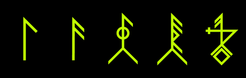
Creating a mark with Runic influence would typically begin with a central upright stem, that would connect with diagonal strokes. The application of a single diagonal line pointing downward is thought to symbolise ‘water’. Could this possibly signify transportation via river or overseas? Such a symbol would form the basis of a design, allowing its maker the option to further embellish with shape and geometric line. But are these additional elements purely compositional or indicate an expanded narrative? Some merchants’ marks featured characters like an arrow, or star and crescent moon. Their meaning may represent direction, guidance or protection.

The theme of protection was found in other graphic devices. The Middle Ages was a time of great superstition, and symbols were created to reassure a society fearful of illness, misfortune and the unknown. Signs of Protection were mostly compass-drawn onto church walls with the purpose to guard against evil. It was possibly believed that their complex circular patterns could lure and trap demons.
Not all elaborate Medieval graphic devices were devised for supernatural purposes. Designs of purely geometric composition would often symbolise high standards of craftsmanship. Stone masons applied signs of angular line, as a signature of work rendered toward the build of churches and cathedrals. This method of angular design was also applied to merchants marks, though sometimes created differently in the form of redacted line and shape.

Connecting the Past and Present
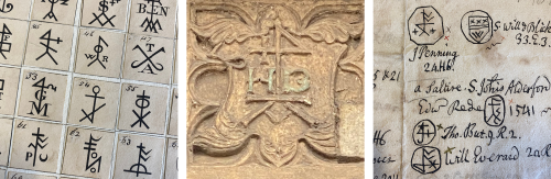
Medieval trademarks represent a relatively unknown history of logo design. They were originally researched in the early 1700s by the antiquarian John Kirkpatrick (1687–1728), and later informed the book, ‘Notices of the Merchants’ Marks in the City of Norwich’, by William C Ewing, 1850. It featured hundreds of merchants’ marks rendered in pen and ink. Today, the Logo Rewind project endeavours to digitally preserve their legacy but also connect with the contemporary practice of brand design. This collection of Medieval trademarks reveals a curious visual language that communicates with a minimum of elements, and can be viewed as a precursor to the modernist trademarks of the 20th century.
![]()
Interestingly, the work of Logo Rewind is now influencing contemporary creatives. This fascinating talk concluded with a new merchant’s mark designed in 2022 for the Cardinal Hand, a duo of printmakers and illustrators based in St Augustines, Norwich. Their logo device can be seen above the door of their premises. Its design displays medieval design characteristics and prominently features the Sign of Four. Whether carved into wood or stone, etched upon brass, hand-drawn or even digitally remade, Medieval merchants’ marks have survived to fascinate a new generation.
For more information, visit Instagram: @merchantmarks.norwich
Released by UEA Publishing Project in October 2023, Logo Rewind - Trademarks of Medieval Norwich is a new book edited by designer, researcher and educator, Darren Leader that collects and digitally remakes over 200 trademarks from Medieval Norwich. The book includes introductions and essays by big names from the world of design and UEA academics exploring the history of merchants’ marks, logo histories and examples of previous historic preservation.