Our lead logo
Our lead logo's classic design is bold, confident and complements our modern visual identity. Where UEA is communicating at an organisational level and not from within a School or department, we should always lead with this leading UEA logo with a Blue glint. UEA should always be in Black, White or Dark Grey.
Example uses: UEA website, UEA-wide recruitment materials, corporate plan, corporate social media channels, press releases.

Logo variants
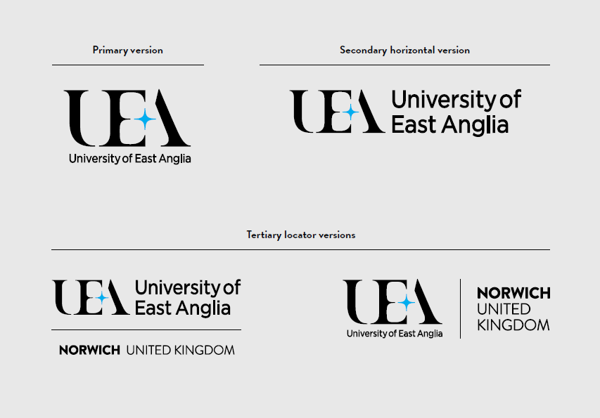
Our logo is available for use in a number of variants:
-
Primary stacked version
-
Secondary horizontal version
-
Tertiary 'locator' variant - for use when the audience is less familiar with UEA's location in Norwich, such as global audiences

Logo positioning
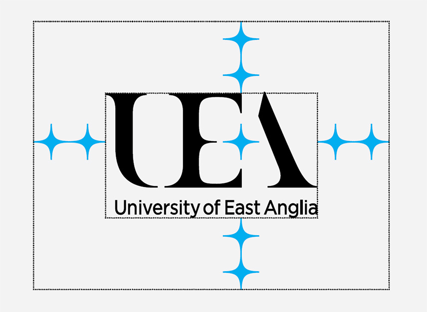
To ensure the logo has room 'to breathe' and is legible, take the distance of two Glints as the clearspace around the logo.

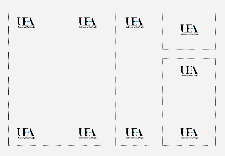
Always look to position the logo in one of these areas of your design. Generally, centre alignments work well for digital applications such as web banners - but pay attention to the alignment of your text in relation to the logo.
A vertically and horizontally centred alignment should be used for end frames on videos. This is beneficial since generally this will then not obscure closed captions when typically sit at the bottom of the video.

Getting a logo
All core logos are available to download from UEA's Asset Bank, and are available in black and white with glints in our core colour palette. Logo descriptors for Schools and departments can be created in Outfit.

:focus(2922x1376:2923x1377))